Microeconomics > QUESTIONS & ANSWERS > California State University, San Marcos ECON 201 Micro Economics ECO 201 & 202 Quizz 4 (All)
California State University, San Marcos ECON 201 Micro Economics ECO 201 & 202 Quizz 4
Document Content and Description Below
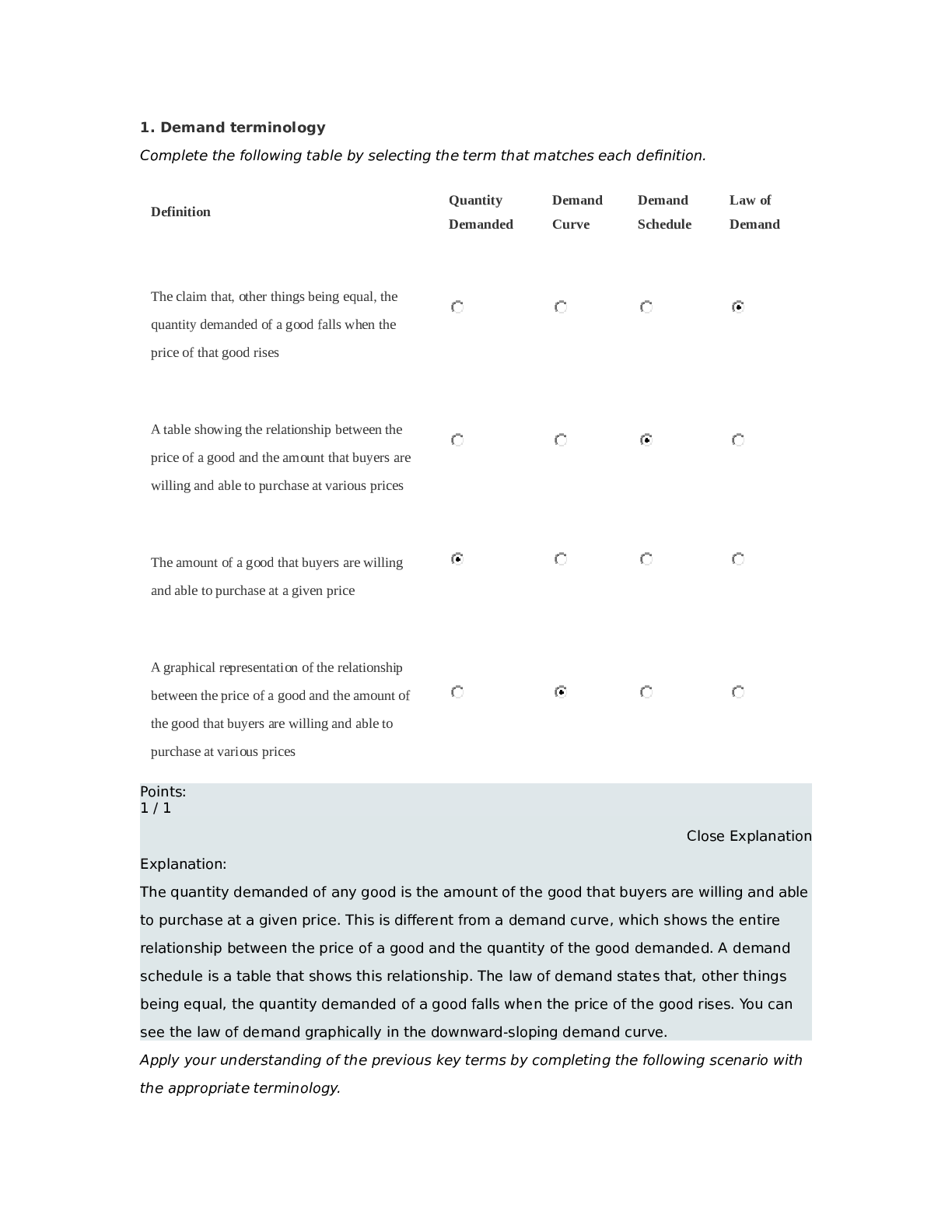
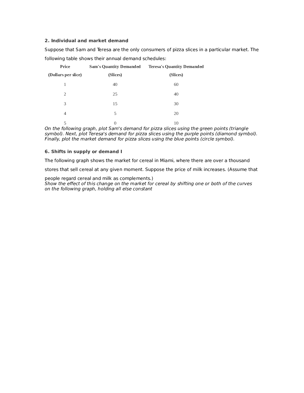
2. Individual and market demand Suppose that Sam and Teresa are the only consumers of pizza slices in a particular market. The following table shows their annual demand schedules: Price Sam's Quant... ity Demanded Teresa's Quantity Demanded (Dollars per slice) (Slices) (Slices) 1 40 60 2 25 40 3 15 30 4 5 20 5 0 10 On the following graph, plot Sam's demand for pizza slices using the green points (triangle symbol). Next, plot Teresa's demand for pizza slices using the purple points (diamond symbol). Finally, plot the market demand for pizza slices using the blue points (circle symbol). 6. Shifts in supply or demand I The following graph shows the market for cereal in Miami, where there are over a thousand stores that sell cereal at any given moment. Suppose the price of milk increases. (Assume that people regard cereal and milk as complements.) Show the effect of this change on the market for cereal by shifting one or both of the curves on the following graph, holding all else constantExplanation: Cereal and milk are complementary goods because people like to consume them together. When the price of milk increases, it becomes more costly to consume milk and cereal together. Therefore, people decrease their consumption of cereal at any given price. Consequently, the demand for cereal decreases, and the demand curve shifts to the left. Notice that it is the price of milk, rather than the quantity demanded of milk, that changes the demand for cereal. Note that the supply curve does not shift because none of the factors affecting supply have changed. In particular, the supply curve shifts in response to changes in the following: Factors Affecting Supply • Price of inputs • Production technology • Number of producers • Expectations of producers 5. A change in supply versus a change in quantity supplied 5. A change in supply versus a change in quantity supplied The following calculator shows the supply curve for sedans in an imaginary market. For simplicity, assume that all sedans are identical and sell for the same price. Two factors thataffect the supply of sedans are the level of technical knowledge—in this case, the speed with which manufacturing robots can fasten bolts, or robot speed—and the wage rate that auto manufacturers must pay their employees. Initially, the graph shows the supply curve when robots can fasten 2,500 bolts per hour and autoworkers earn $25 per hour. Use the graph input tool to help you answer the following questions. You will not be graded on any changes you make to this graph. Note: Once you enter a value in a white field, the graph and any corresponding amounts in each grey field will change accordingly. Graph Input Tool Supply for Sedans Price of a Sedan (Thousands of dollars) 20Supply for Sedans Quantity Supplied (Sedans per month) SUPPLY SHIFTERS Robot Speed (Bolts per hour) Autoworker Wage (Dollars per hour) Consider the previous graph. Suppose that the price of a sedan decreases from $31,000 to $26,000. This would cause the selector 1 quantity supplied of sedans to decrease, which is reflected on the graph by a selector 2 movement along the supply curve. Points: 0.5 / 1 Close Explanation Explanation: The supply curve shows the relationship between the price of a good and the quantity 225 2500 25supplied, other factors held constant. Therefore, when the price of the good changes, the result is a movement along the supply curve (changing the quantity supplied), not a shift of the entire supply curve. Since the supply curve is upward sloping, a decrease in the price of sedans causes a decrease in the quantity of sedans supplied. Following a technological decline—for example, a decrease in the speed with which robots can attach bolts to cars—there is a selector 1 leftward shift of the supply curve because the technological decline makes cars selector 2 more expensive to build . Points: 1 / 1 Close Explanation Explanation: The supply curve shows the relationship between the price of a good and the quantity supplied, other factors held constant. One of those other factors is technology—that is, the production process by which resources are transformed into goods and services. If technology declines, fewer goods can be produced with the same number of inputs. In this case, slower robots produce fewer automobiles each month, which results in a lower quantity supplied at each price. Graphically, a decrease in quantity at every price (as opposed to a decrease due to a change in price) is shown as a leftward shift of the supply curve. [Show More]
Last updated: 1 year ago
Preview 1 out of 27 pages
Reviews( 0 )
Document information
Connected school, study & course
About the document
Uploaded On
Oct 04, 2022
Number of pages
27
Written in

Additional information
This document has been written for:
Uploaded
Oct 04, 2022
Downloads
0
Views
162


.png)