Business > STUDY GUIDE > BUSI 201 Assignment 10 Excel 2016 Skill Review 7.1 Liberty University answers complete solutions (All)
BUSI 201 Assignment 10 Excel 2016 Skill Review 7.1 Liberty University answers complete solutions
Document Content and Description Below
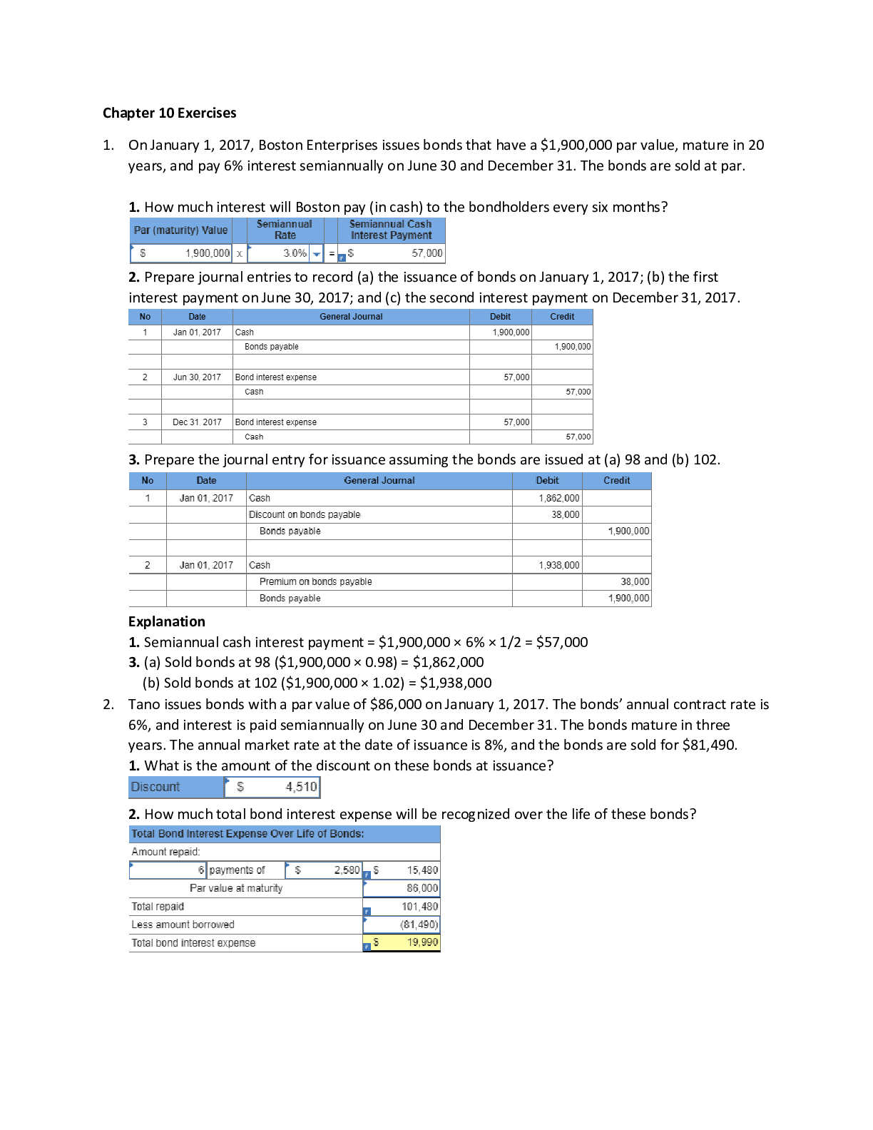
BUSI 201 Assignment 10 Excel 2016 Skill Review 7.1 Liberty University answers complete solutions Complete many different versions to get an A on your grade! Download it for more and ace on your assign... ments! Skill Review 7.1 3. Add Sparklines to the data and apply a Quick Style. a. On the Population Data worksheet, select cells B4:F13. b. On the Insert tab, in the Sparklines group, click the Column button. c. In the Create Sparklines dialog, verify that B4:F13 is the Data Range and specify G4:G13 as the Location Range. Click OK. d. On the Sparkline Tools Design tab, in the Style group, apply the Dark Blue, Sparkline Style Dark #6 style. Click the More button to expand the gallery, then click the first style from the right in the fifth row. 4. Change the Sparklines to lines with markers for all data points and highlight the high point marker in a different color. a. On the Sparkline Tools Design tab, in the Type group, click the Line button. b. On the Sparkline Tools Design tab, in the Show group, click the Markers check box. c. On the Sparkline Tools Design tab, in the Style group, click the Marker Color button, point to High Point, and select Red (the second color from the left in the row of standard colors). 5. Create a column chart to represent the population data for Dallas and then add a second series to represent the overall population of the United States. 6. Change the chart type to a combination chart with a secondary axis for the national population data. 7. Add a legend above the chart and format it by applying a style. 8. Change the fill color of a data point to make it stand out. a. Select the data point for 1990 for the series Dallas, TX by clicking the 1990 column once to select the series and then clicking it a second time to select just that data point. b. On the Chart Tools Format tab, in the Shape Styles group, click the Shape Fill button and select Red, Accent 2 (the fifth color from the right in the first row of theme colors). 9. Save this chart as a new chart template. 10. Add a callout to the chart, apply a style to it, and add text. 11. Create a new chart from the template you saved. a. Select cells A3:F4. Press [Ctrl] and click and drag to select cells A12:F12. b. On the Insert tab, in the Charts group, click the dialog launcher to open the Insert Chart dialog. c. In the Insert Chart dialog, click the All Charts tab. d. Click Templates. If necessary, select the Population Combo Chart template. f. If necessary, move the chart so it is positioned to the right of the first chart as shown in Figure EX 7.62. 12. Change the outline color of a data series. a. Select the New York, NY data series by clicking any column in the second chart. 13. Create a clustered column chart for population growth by region. Move the chart to its own chart sheet named Regional Trends. 14. Edit and format the chart title. 15. Add trendlines to the chart to forecast exponential growth for the next 40 years. h. Right-click any data point in the Midwest series and select Add Trendline.... Apply the same formatting options as you applied to the Northeast trendline: exponential, forecasting forward for 4 periods, 4 pt width, and arrow type End Arrow. i. Follow the same steps to add a trendline to each of the other data series using the same formatting options (exponential, forecasting forward for 4 periods, 4 pt width, and arrow type End Arrow). The final chart should look similar to Figure EX 7.63. [Show More]
Last updated: 1 year ago
Preview 1 out of 6 pages

Reviews( 0 )
Document information
Connected school, study & course
About the document
Uploaded On
Feb 21, 2021
Number of pages
6
Written in

Additional information
This document has been written for:
Uploaded
Feb 21, 2021
Downloads
0
Views
58


.png)