Computer Science > PROJECT FINAL > University of California, Berkeley DATA 8 DATA8 project2 (All)
University of California, Berkeley DATA 8 DATA8 project2
Document Content and Description Below
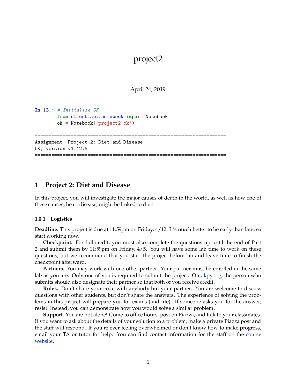
project2 April 24, 2019 In [3]: # Initialize OK from client.api.notebook import Notebook ok = Notebook('project2.ok') ===================================================================== Assign... ment: Project 2: Diet and Disease OK, version v1.12.5 ===================================================================== 1 Project 2: Diet and Disease In this project, you will investigate the major causes of death in the world, as well as how one of these causes, heart disease, might be linked to diet! 1.0.1 Logistics Deadline. This project is due at 11:59pm on Friday, 4/12. It’s much better to be early than late, so start working now. Checkpoint. For full credit, you must also complete the questions up until the end of Part 2 and submit them by 11:59pm on Friday, 4/5. You will have some lab time to work on these questions, but we recommend that you start the project before lab and leave time to finish the checkpoint afterward. Partners. You may work with one other partner. Your partner must be enrolled in the same lab as you are. Only one of you is required to submit the project. On okpy.org, the person who submits should also designate their partner so that both of you receive credit. Rules. Don’t share your code with anybody but your partner. You are welcome to discuss questions with other students, but don’t share the answers. The experience of solving the problems in this project will prepare you for exams (and life). If someone asks you for the answer, resist! Instead, you can demonstrate how you would solve a similar problem. Support. You are not alone! Come to office hours, post on Piazza, and talk to your classmates. If you want to ask about the details of your solution to a problem, make a private Piazza post and the staff will respond. If you’re ever feeling overwhelmed or don’t know how to make progress, email your TA or tutor for help. You can find contact information for the staff on the course website. 1Tests. Passing the tests for a question does not mean that you answered the question correctly. Tests usually only check that your table has the correct column labels. However, more tests will be applied to verify the correctness of your submission in order to assign your final score, so be careful and check your work! Advice. Develop your answers incrementally. To perform a complicated table manipulation, break it up into steps, perform each step on a different line, give a new name to each result, and check that each intermediate result is what you expect. You can add any additional names or functions you want to the provided cells. All of the concepts necessary for this project are found in the textbook. If you are stuck on a particular problem, reading through the relevant textbook section often will help clarify the concept. To get started, load datascience, numpy, plots, and ok. In [4]: from datascience import * import numpy as np %matplotlib inline import matplotlib.pyplot as plots plots.style.use('fivethirtyeight') np.set_printoptions(legacy='1.13') from client.api.notebook import Notebook ok = Notebook('project2.ok') _ = ok.auth(inline=True) ===================================================================== Assignment: Project 2: Diet and Disease OK, version v1.12.5 ===================================================================== Successfully logged in as [email protected] 2 Diet and Cardiovascular Disease In the following analysis, we will investigate the world’s most dangerous killer: Cardiovascular Disease. Your investigation will take you across decades of medical research, and you’ll look at multiple causes and effects across two different studies. Here is a roadmap for this project: • In Part 1, we’ll investigate the major causes of death in the world during the past century (from 1900 to 2015). • In Part 2, we’ll look at data from the Framingham Heart Study, an observational study into cardiovascular health. • In Part 3, we’ll examine a claim from the Nurses’ Health Study that hormone replacement therapy reduces the risk of coronary heart disease for post-menopausal women. • In Part 4, we’ll run a hypothesis test on data based on the results of the Heart and EstrogenProgestin Replacement Study. 22.1 Part 1: Causes of Death In order to get a better idea of how we can most effectively prevent deaths, we need to first figure out what the major causes of death are. Run the following cell to read in and view the causes_of_death table, which documents the death rate for major causes of deaths over the last century (1900 until 2015). In [5]: causes_of_death = Table.read_table('causes_of_death.csv') causes_of_death.show(5) <IPython.core.display.HTML object> Each entry in the column Age Adjusted Death Rate is a death rate for a specific Year and Cause of death. The Age Adjusted specification in the death rate column tells us that the values shown are the death rates that would have existed if the population under study in a specific year had the same age distribution as the "standard" population, a baseline. This is so we can compare ages across years without worrying about changes in the demographics of our population. Question 1: What are all the different causes of death in this dataset? Assign an array of all the unique causes of death to all_unique_causes. In [6]: all_unique_causes = causes_of_death.group("Cause").column("Cause") sorted(all_unique_causes) Out[6]: ['Accidents', 'Cancer', 'Heart Disease', 'Influenza and Pneumonia', 'Stroke'] In [7]: ok.grade("q1_1"); ~~~~~~~~~~~~~~~~~~~~~~~~~~~~~~~~~~~~~~~~~~~~~~~~~~~~~~~~~~~~~~~~~~~~~ Running tests --------------------------------------------------------------------- Test summary Passed: 1 Failed: 0 [ooooooooook] 100.0% passed In [8]: # This function may be useful for Question 2. def elem(x): return x.item(0) Question 2: We would like to plot the death rate for each disease over time. To do so, we must create a table with one column for each cause and one row for each year. Create a table called causes_for_plotting. It should have one column called Year, and then a column with age-adjusted death rates for each of the causes you found in Question 1. There should be as many of these columns in causes_for_plotting as there are causes in Question 1. Hint: Use pivot, and think about how the elem function might be useful in getting the Age Adjusted Death Rate for each cause and year combination. 3 [Show More]
Last updated: 1 year ago
Preview 1 out of 30 pages
Reviews( 0 )
Document information
Connected school, study & course
About the document
Uploaded On
Jul 09, 2021
Number of pages
30
Written in
Additional information
This document has been written for:
Uploaded
Jul 09, 2021
Downloads
0
Views
88




.png)


